Form Layout Options
TrueContext helps you deliver a best-in-class technician experience by offering a variety of layouts for different sections in your forms. The layouts that you choose depend on how you want to collect and display information. This topic describes each layout option and when to use it.
Available on all tiers with more options on the Intelligent and Elite tiers:
- Form layouts apply only to forms when displayed in the Mobile App, not to output documents.
- The topic Form Pages and Sections provides guidance on planning the structure of your forms.
Contents
Regular Section Layout Options
The following examples show the different layout options for a Regular Section![]() A Regular Section is a set of related questions grouped together for easy reference. The data captured is “non-repeating”. That is, field users enter a single instance of each answer..
A Regular Section is a set of related questions grouped together for easy reference. The data captured is “non-repeating”. That is, field users enter a single instance of each answer..
Over-Under “Stacked”
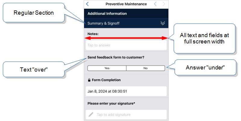
Use this layout for:
- Long question text or answers.
- Question types that display best at full-width.
Info:A Template-Based Section![]() A template-based section is a tool that enables form designers to easily create and edit sections for forms with repeated structures. Template-based sections help create a consistent workflow for users, while saving form designers time by only having to edit questions in one place. has the same over-under layout as a Regular Section
A template-based section is a tool that enables form designers to easily create and edit sections for forms with repeated structures. Template-based sections help create a consistent workflow for users, while saving form designers time by only having to edit questions in one place. has the same over-under layout as a Regular Section![]() A Regular Section is a set of related questions grouped together for easy reference. The data captured is “non-repeating”. That is, field users enter a single instance of each answer..
A Regular Section is a set of related questions grouped together for easy reference. The data captured is “non-repeating”. That is, field users enter a single instance of each answer..
Side-by-Side
Available on the Intelligent and Elite tiers:
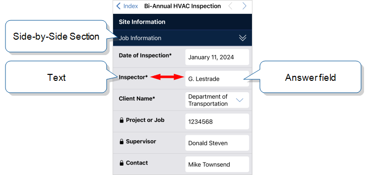
A Side-by-Side Section is a variation of a Regular Section![]() A Regular Section is a set of related questions grouped together for easy reference. The data captured is “non-repeating”. That is, field users enter a single instance of each answer.. The term Side-by-Side refers to a condensed, two-column, question-answer layout.
A Regular Section is a set of related questions grouped together for easy reference. The data captured is “non-repeating”. That is, field users enter a single instance of each answer.. The term Side-by-Side refers to a condensed, two-column, question-answer layout.
Use a Side-by-Side layout for:
- Short question text.
- Short answer text.
- Short text in options-based questions
 Options-based questions are questions that display a list of options for field users to choose from. These include Button Group, Card List, Dropdown, Multiselect, and Radio Button questions., such as Button Groups that have only “Pass” and “Fail” options.
Tip:To ensure the best user experience, some question types always display at full width in a Side-by-Side section.
Multicolumn “Flow”
Available on the Intelligent and Elite tiers:
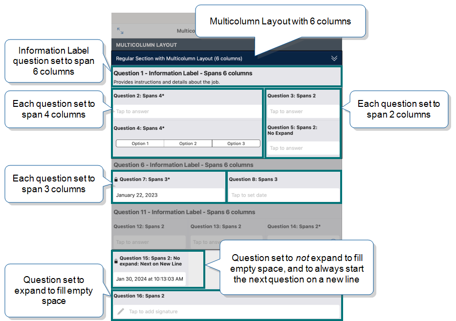
The Multicolumn Layout![]() A Multicolumn Layout is an option for questions in a Regular Section. This highly flexible layout gives form designers control over how question are displayed on the Mobile App. gives you greater control over the presentation of Regular Sections. Questions “flow” from one to the next. The Multicolumn Layout includes options to:
A Multicolumn Layout is an option for questions in a Regular Section. This highly flexible layout gives form designers control over how question are displayed on the Mobile App. gives you greater control over the presentation of Regular Sections. Questions “flow” from one to the next. The Multicolumn Layout includes options to:
- Display more than one question per line.
- Hide question text.
- Set up a question to span multiple columns.
- Insert manual line breaks.
Repeatable Section Layout Options
Repeatable Sections![]() A Repeatable Section is a subform that contains a set of related questions. The data captured is “repeating”, because the field user can complete the same subform more than once, which creates multiple entries. display configurable Summary Table views that make it easy for field users to review, edit, and add information. The following examples show the different layout options for Summary Table views.
A Repeatable Section is a subform that contains a set of related questions. The data captured is “repeating”, because the field user can complete the same subform more than once, which creates multiple entries. display configurable Summary Table views that make it easy for field users to review, edit, and add information. The following examples show the different layout options for Summary Table views.
Note:Use a Repeatable Section![]() A Repeatable Section is a subform that contains a set of related questions. The data captured is “repeating”, because the field user can complete the same subform more than once, which creates multiple entries. only for its intended purpose of adding information in a repeating subform. Do not use a Repeatable Section to achieve a particular layout. If you need additional layout options for questions in a Regular Section, consider upgrading to the Intelligent or Elite tier
A Repeatable Section is a subform that contains a set of related questions. The data captured is “repeating”, because the field user can complete the same subform more than once, which creates multiple entries. only for its intended purpose of adding information in a repeating subform. Do not use a Repeatable Section to achieve a particular layout. If you need additional layout options for questions in a Regular Section, consider upgrading to the Intelligent or Elite tier
Summary Table Compact View
The Summary Table Compact View![]() The term "compact view" refers to a Summary Table in a Repeatable Section. The compact view displays the Summary Table "inline" with the rest of the form. The "full view", by contrast, displays only the Summary Table. is displayed in the main form.
The term "compact view" refers to a Summary Table in a Repeatable Section. The compact view displays the Summary Table "inline" with the rest of the form. The "full view", by contrast, displays only the Summary Table. is displayed in the main form.
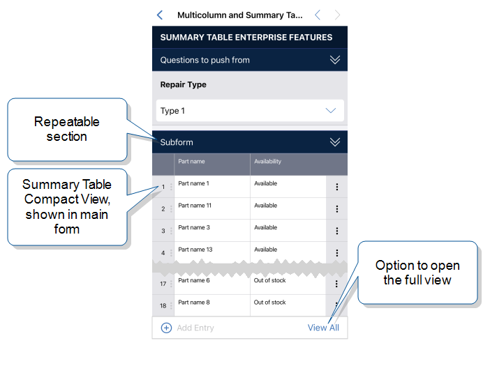
Compact View
Available on the Intelligent and Elite tiers:
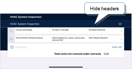
Hide headers
Choose the option to hide headers on the Mobile App if:
- You want to simplify the display, especially on small screens.
- Field users don't need the headers to understand what’s in each table cell.
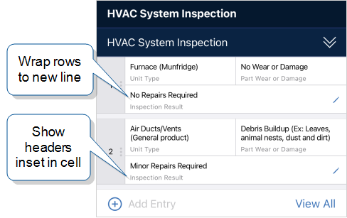
Wrap rows... and Show headers inset in cell
This example shows what the Summary Table looks like when a row wraps to a new line. The headers are displayed within each table cell.
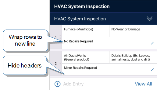
Wrap rows... and Hide headers
This example shows the Summary Table with both the Wrap rows… and Hide headers options selected. This simplifies the on-screen display and saves space.
Summary Table Full View
The Summary Table Full View![]() The term "full view" refers to a Summary Table in a Repeatable Section. When a field user selects the "View All" option, the table opens in full view, and no other part of the form is visible. The "compact view", by contrast, displays the Summary Table "inline" with the rest of the form. opens a new page that’s separate from the main form.
The term "full view" refers to a Summary Table in a Repeatable Section. When a field user selects the "View All" option, the table opens in full view, and no other part of the form is visible. The "compact view", by contrast, displays the Summary Table "inline" with the rest of the form. opens a new page that’s separate from the main form.
Full View
Available on the Intelligent and Elite tiers:
Allow users to sort by column
This example shows the Summary Table full view sorted by the Cost column in ascending (increasing) order.
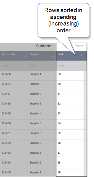
Tip:Sorting only changes the row display order, not the actual row order in the subrecord. To change the actual order, users drag a row to move it.
Allow users to filter by column
This example shows the Summary Table full view filtered by the Availability column. Only the rows with matching values are displayed.
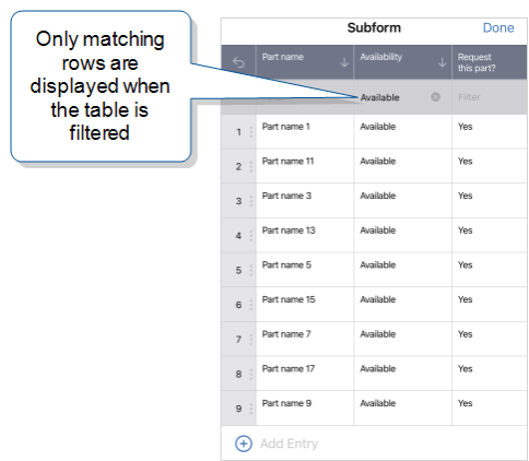
Tip:You can filter on more than one column to limit the results even more.
Inline Editing
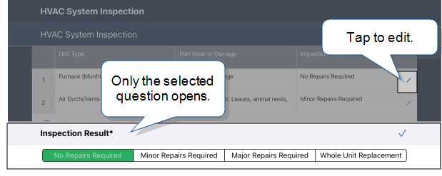
You can set up a Summary Table with inline editing to make it simpler for users to edit answers. When a field user taps the edit icon, only the selected question opens, not the whole subform. Inline editing works in both the Compact and Full views.
The following example shows how inline editing works when the Button Group question is set to the Display Value.
If you set up a column to display a Control, users can edit directly in the table.