Question Type: Card List
A Card List question makes it easy for field technicians to find and select an option based on an image. For example, a technician can select a piece of equipment based on how it looks rather than on a detailed serial number.
Available on the Advanced and Enterprise tiers:
Supported on app versions:
| iOS | 14.4 or later |
| Android | 14.3 or later |
| Windows | 14.3 or later |
Contents
What is a Card List question?
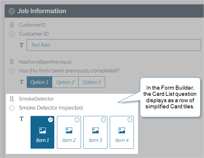
A Card List question contains between two and ten response options called Cards. Each Card contains a Resource Image resource, a brief description, and an associated server value. A technician can work more efficiently and accurately because they can compare the images to objects in front of them. When the technician submits the form, the system records the associated value as the answer to the Card List question.
Tip:You can configure Conditional Logic rules with Card List questions to create a more dynamic workflow.
Example of a Card List question
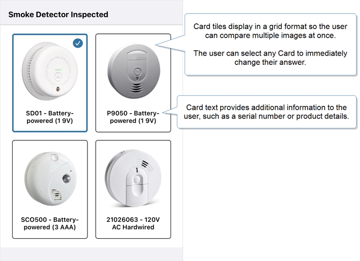
A technician might service multiple different smoke detector models during their shift. These smoke detectors have long serial numbers that look very similar to each other at a glance. Normally, the technician compares each unit’s serial number to the list on their form, which can be a slow and error-prone process.
A Card List enables the technician to glance at an image instead of a serial number to find the correct unit. If two items look similar, then the technician can compare serial numbers from the Card description to select the correct unit.
When the technician finds their answer to the Card List question, their selection is indicated by a blue outline and check mark. The technician can easily select another Card to change their answer before they submit the form.

Note:The Card List tile sizes adjust to fit the largest Resource Image in the question. This makes smaller images harder to see. To make all Card images clearly visible, upload Resource Images with the same dimensions for all images.
When to use a Card List question
A Card List behaves like a Button Group or Radio Button question combined with a Resource Image question. As with these options-based questions, a user can select only one response from the presented options. A Card List, however, provides a visual aid as the focus for each question option.
The following table can help you decide if you need a Card List, Button Group, Radio Button, or Resource Image question:
| Question Type | Number of Options/Attachments | Visual Aid Type |
|---|---|---|
| Card List |
|
Card List options include both an image and text to help users quickly identify their selection. Tip:The server receives only the value of the submitted answer. This means that the linked Resource Images don’t contribute to the overall submission size limit. |
| Button Group |
|
You can apply a color to a Button Group response, but it only shows after the user selects it. |
| Radio Button |
|
There is no visual aid—Radio Button answers contain only text. |
| Resource Image |
|
Resource Image questions serve as read-only reference material for the user. |
10 images per question
100 images per page
100 images per form
Create or edit a Card List question
Prerequisites
-
You must be either:
-
A TrueContext Admin user.
-
A member of a FormSpace
 FormSpaces are where forms are stored and organized in the TrueContext Web Portal. A TrueContext Team may have multiple FormSpaces, depending on their needs. Admins can set FormSpace permissions to control which users have access to the forms in that FormSpace. group with Can Create permissions.
-
-
Make sure that the images you want to use are already uploaded as Resource Images within your FormSpace.
Info:The topic Resource Images describes how to add and configure Resource Images.
Steps to create or edit a Card List question
-
Select the form you want to work on:
Forms & Integrations > List Forms > FormName
-
Select Edit Form.
Result: The system opens the form in edit mode.
-
Do you want to create a new Card List question?
-
If yes, add a new question.
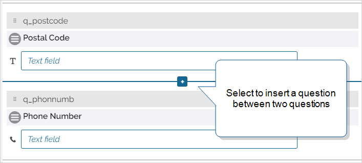
You have two options when adding a new question:
-
Hover between two questions, and select the plus sign [+].
-
Scroll to the bottom of a section and select ADD A QUESTION.
To move a question, drag it to one of the separators between questions or to an empty section. You can also move a question to another page by dragging it to the Form Index.
-
-
If no, select the existing Card List question you want to edit, and then go to step 5.
-
-
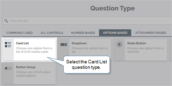
On the Question Type page, select the Options-Based tab, and then select Card List from the list.

Tip: To filter the list, start typing the name of the question type and then select an option.
Result: The system displays the configuration page for the Card List question.
-
Enter the Question Text and Unique ID
 A Unique ID refers to the specific identifier of a question, form page, form section, or Data Destination. Unique IDs are used as reference points when pulling data for conditional logic, Analytics projects, Data Destinations, and Documents., set the Data Type, and apply Restrictions.
The following Data Types are available for Card List:
-
Free Text
-
Email Address
-
URL
-
Phone Number
-
Integer
-
Decimal
-
Currency
-
-
On the Options tab, configure the options fields:
-
Value submitted to server: Enter the response that the server receives and displays after a user submits the form. This field has a maximum of forty characters.
Tip:The server receives only the value of the submitted answer. This means that the linked Resource Images don’t contribute to the overall submission size limit.
-
Text displayed on device (Optional): Enter a short description, such as a product name or code, for the user to see on the Card. This field has a maximum of forty characters. If you want to use the same text as the server value, leave this field blank.
Tip:For any Documents that you link to the form, you can choose whether to show the display or server value.You can also use the DREL
[display]property to reference the display value instead of the server value:%a[QuestionUniqueID][display]Info:If your team has the Multi-Language Forms add-on, you can translate the display value (but not the server value). When a field user selects a language, they see the translated display value.To show the translated display value in a Repeatable Section
 A Repeatable Section is a subform that contains a set of related questions. The data captured is “repeating”, because the field user can complete the same subform more than once, which creates multiple entries. Summary Table, edit the column settings and set the Answer value to display to Display Value.
 -
Image displayed on device: Select an image for the user to see on the Card. Images do not display on the form submission details page or in documents.
Note:The image file must be in your FormSpace Resource Images before you can select it.
-
-
Repeat step 6 for up to ten options.
-
Configure the question’s Properties (optional), including Answer Exceptions, Additional Comments, and Help Options.
-
Select Save.
Result: The system saves your changes to the new or edited question.


Tip:Remember to Save and Deploy the form when you’re ready to make it available to your field users.
Translated Card List questions
Available as an add-on to the Enterprise tier:
If your company has the Multi-Language add-on, you can add translated resources to use in Multi-Language forms. If you have the same
If the field technician’s preferred language is unavailable, the images display in a primary language. A user with Can Create permissions selects the primary language when they set up the Resource Image.
Info:The topic Resource Images: Set up multiple languages describes this process in more detail.

